Value and Saturation
Color is actually a combination of two things – Value and Saturation.
Value
No matter what color you want to paint in, you should always think about value first.
That is more important. The sooner you get used to this idea, the faster your paintings will improve.
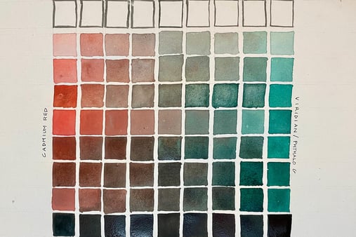
Value refers to how light or dark a color is. Look at the chart above.
The bottom row of boxes seems to be painted in some color of black. But in fact, it is just a combination of two watercolors that are opposite and furthest away from each other on the color wheel – Cadmium red and Viridian.
Then, by successively and progressively adding more and more water, we transition towards grays, till we reach pure white of the paper in the middle box of the top row.
Saturation
Similar to this, the left-most and right-most boxes in the middle row are the pure colors of Cadmium Red and Viridian. As we move from right to left, more and more Vermilion Hue is added to the Viridian, and the colors get less and less intense towards the middle, tending more towards different shades of gray.
Value + Saturation
Taking both aspects together, values tend to go from lightest to darkest in value from top to bottom, while the saturation tends to be least in the middle and highest at the left and right-most boxes of this color chart.
Now it’s your turn to do a value and saturation chart.
Go ahead, grab your supplies and give it a shot!